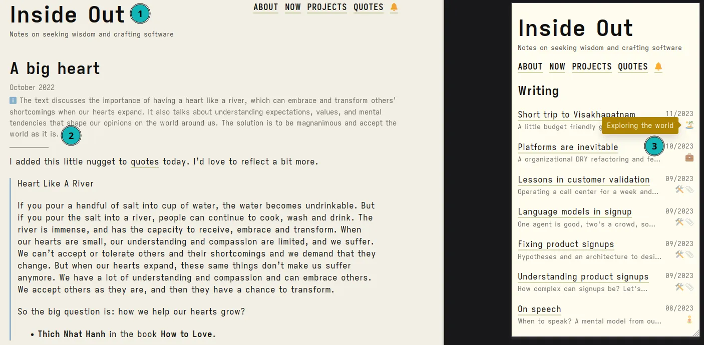
We recently updated the theme for this webpage and worked on improving the accessibility in the process. This post is a summary of the changes.

Principles
- Use the device and user preferences.
- Allow the reader to decide if an article is worth their time.
- Optimize for long form personal essays.
(1) System fonts
Embraced system fonts for all the content. System fonts are built in your device and are picked up by the browser to render content. This provides a system native look and readability. Also, no more layout shifts during website render.
There are several starter guides for switching to
system fonts. These allow you to choose a serif or sans-serif base. We
followed something slightly more radical - don’t define any font-family for
the body. Just use whatever is device preset or user preferred (as configured
in the browser). The only exception is we use ui-monospace font for the code
blocks.
The cost of this is we’re no longer in control. We don’t know how this website will appear on the Device X from two decades back or the latest Device Z with Browser B. Let the device and user choose what works for them instead of me.
(2) Summaries and AI
We’re using two sets of summaries for this website now. A human provided synopsis of the article content. And an AI generated summary for the post. On the page, we attempt to show the human one first, and if not available fallback to the AI one.
These AI summaries are generated using a Llama derived model running on the CPU. You can see the prompt in this script.
(3) Categories and tooltips
Sometimes the summaries are too long. Categories might provide a quicker
decision making. We used emojis for these supplemented by nice tooltips powered
by astro-tooltips and tippy.js.
For emojis 1, I found https://www.emojisearch.app/ to be an excellent semantic search engine. Now there’s a way to translate words to emotions 😉 While we’re at it, let me give a shout-out to the https://github.com/hrsh7th/cmp-emoji/ neovim completion engine for helping me type in emojis.
We hope the summaries and categories will help you navigate better.
(4) Themes
This website uses an interesting model for visual themes. We use terminal colorschemes. It’s easy for me to validate what’s readable and what may not be 2 though this may not translate well for general audience. Earlier we were using the papercolor theme and now we’re on flexoki.
We took a bunch of inspiration from modern normalize and this post to redo the CSS and set a good default baseline for the modern browser.
(5) On disclosures and signals
The concept of assumed audience or epistemic status talks about providing a disclosure to the reader on the state-of-mind of the writer along with a signal if this article matches a particular world view. I believe this blog will slowly evolve into my next adventures - we may dive deeper into concepts on philosophical lines of reflection. Now, these will not be interesting to all audiences. My goal is to state these upfront and let the reader use their discretion.
Why not create different sections for these notes? It is additional complexity that I don’t want to support right now. We may revisit this in future along with an option to revisit all posts in a category.
For now, we will indicate such posts with a category (🧘) and a summary tag line as a signal for reader’s judgment.
Footnotes
-
Tooltips are a blessing for people who live under a cave and are now slowly embracing emojis in their language. I am one of them 🙋. Until recently, I used to think 🧵 (thread) as petrol pump. ↩
-
A byproduct of the author living inside editors with certain colorschemes (gruvbox) and using certain fonts (Iosevka). And of course to compensate for the lack of design prowess. ↩