In the last few posts in this series, we defined a conceptual model for signups, built an architecture along with a deep dive into large language model based signup experience. This will be the final post of this series. We’ll delve into how we ran a customer validation with ~100 customers in India and share some lessons learned there.
Here are the all the posts in this series:
- Understanding signup flows
- Fixing product signups
- Language models in signup
- Lessons in customer validation (this post)
Setting it up
Defining the experiment
We used the existing signup flow as control and the newly built prototype as
the treatment. Objective was to run both flows (a) independently for X%, (b)
together for Y%. In the independent setup, customer will run either Control or
Treatment. In the “together” setup, they will run both in a random order.
We measured the completion rate and time to product usage for every flow.
How to experiment?
The cheapest option for us would have been to create an A/B testing setup in the product. Due to various reasons this mechanism was not available on time for the study.
We hired a vendor company to help us run the study with following criteria in mind.
- Unbiased: split each interview session by type - control, treatment, mix, region etc. We explicitly instructed the vendor to treat both Control and Treatment signup completion as success to avoid any bias to treat newer as better.
- Unmoderated - no prompt, question back, no assistance for the customer.
- Filter for right audience - business turnover, organization size, decision-making role etc.
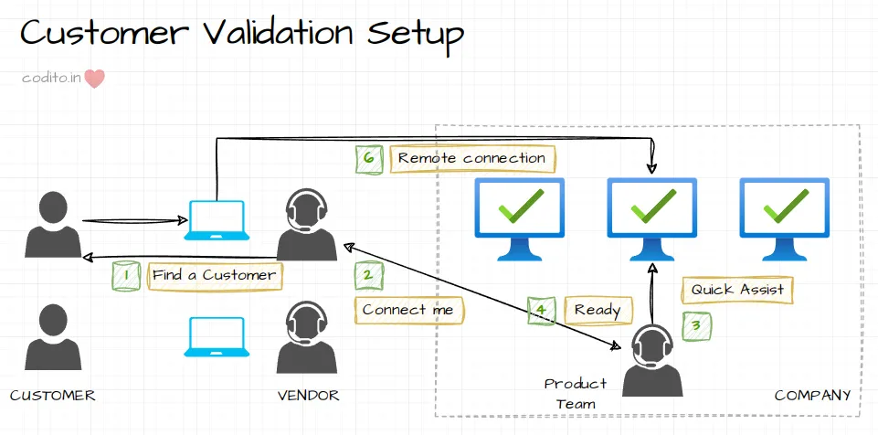
We ran test versions of both Control and Treatment in the company network; asked the Customer to use Quick Assist to access the signup. This also gave us the advantage to use test credit cards for payments.
Watching the show
During the next 10 days, we had a lab setup in the company premises and an 8-10hr on-call with the vendor to create remote desktop connections with the Customers.

We ended up using Quick Assist as the chosen remote desktop solution. The various alternative chat software along with screen sharing had too much lag to negatively impact the experience.
Vendor team was specifically instructed to not guide the Customer in any form. They’ll define the context and handover the laptop. We had designed an exit interview to capture feedback on the flow after the experience.
Seven lessons for next time
Here’s what I learned from this experience.
- Use a real prototype. UX study with a real prototype vs a slide show has its own merits. Some of the frustrations of long-running operations were clearly visible. We could also validate if playing videos during these ungodly pauses helps! Real prototype is much more costly though.
- Be prepared to be humbled. Small UX glitches make a huge difference. E.g., placing the primary button to Left instead of Right confused a large set of Customers.
- Choose your errors. Right level of abstraction is critical. In one of the flows, the experience showed an error that could have been skipped. Most of the Customers were alarmed and paused (felt uneasy) to check if they did something wrong.
- Too much info sucks. Customers were extremely vocal about collecting phone numbers, they were okay with providing work emails. Maybe because they had someone watching over their shoulders (unfortunate side effect of the setup). Other times, they didn’t have the patience to read through the large product comparison tables.
- Unmoderated is better than moderated. Because we had the vendor team accessible and watching over, Customers showed more commitment to complete a signup irrespective of the blockers (e.g., imagine that embarrassing feeling when you’re unable to move past a form while someone is watching you). This impacted both Control and Treatment.
- Customer screening is hard. Completing a study with more than hundred customers in a week is very hard. Our team had to run around large working spaces and find individuals in the right role and willing for an interview.
- Completeness vs best quality is a trade-off for such prototypes. If the prototype is incomplete, you will not get the feedback. If quality is bad, you will get noisy feedback. Walk the line carefully, but you can’t do both.
What would you change for the next time?
- More isn’t always better. Is (implicitly) moderated ~100 user study better than ~10 unmoderated? Not quite sure.
- Telemetry is still the king. We extensively sat and observed each interaction to make notes. End of the day, telemetry captured the raw numbers too. Manual notes took tons of hours, but were helpful in indicating what to look for.
- A/B testing please. It’d have been much cheaper in terms of cost and effort to run the prototype using A/B tests. Maybe readying the prototype would have take more calendar time, but still A/B tests are better.
Thank you for reading through the series of signup posts ❤️ I hope it was useful.